
2023 - 2024
🤠 Design lead
Website
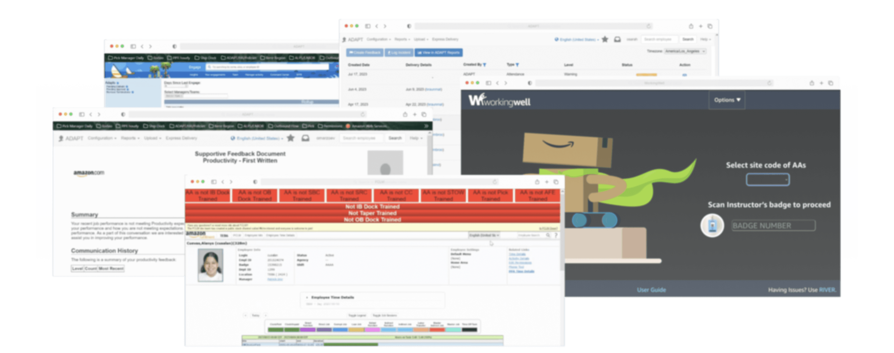
At Amazon’s fulfillment centers, managers were overwhelmed by scattered tools and noisy system-generated signals — making it hard to engage meaningfully with their teams.
While redesigning Engage, I simplified the landing and profile experience with a unified conversation framework, smarter filters, and cleaner insights — helping managers focus less on chasing data, and more on connecting with their people.

Outcome
CSAT
7.5% ⬆️ (4.17 to 4.48)
Manager time saved per week
90-120 Minutes
Task completion rate increased
50.3% ⬆️ (From 44.44% to 94.74%)
👇🏻
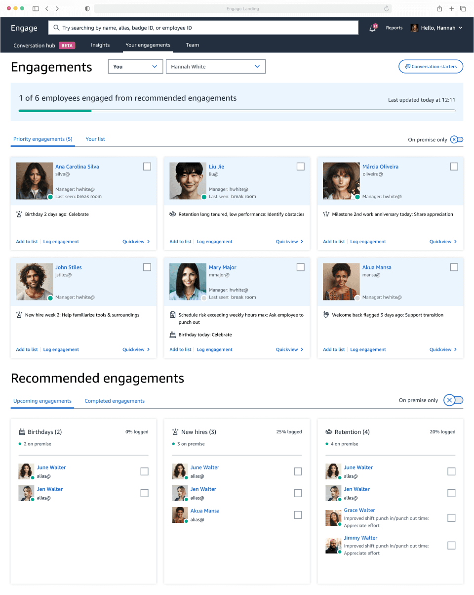
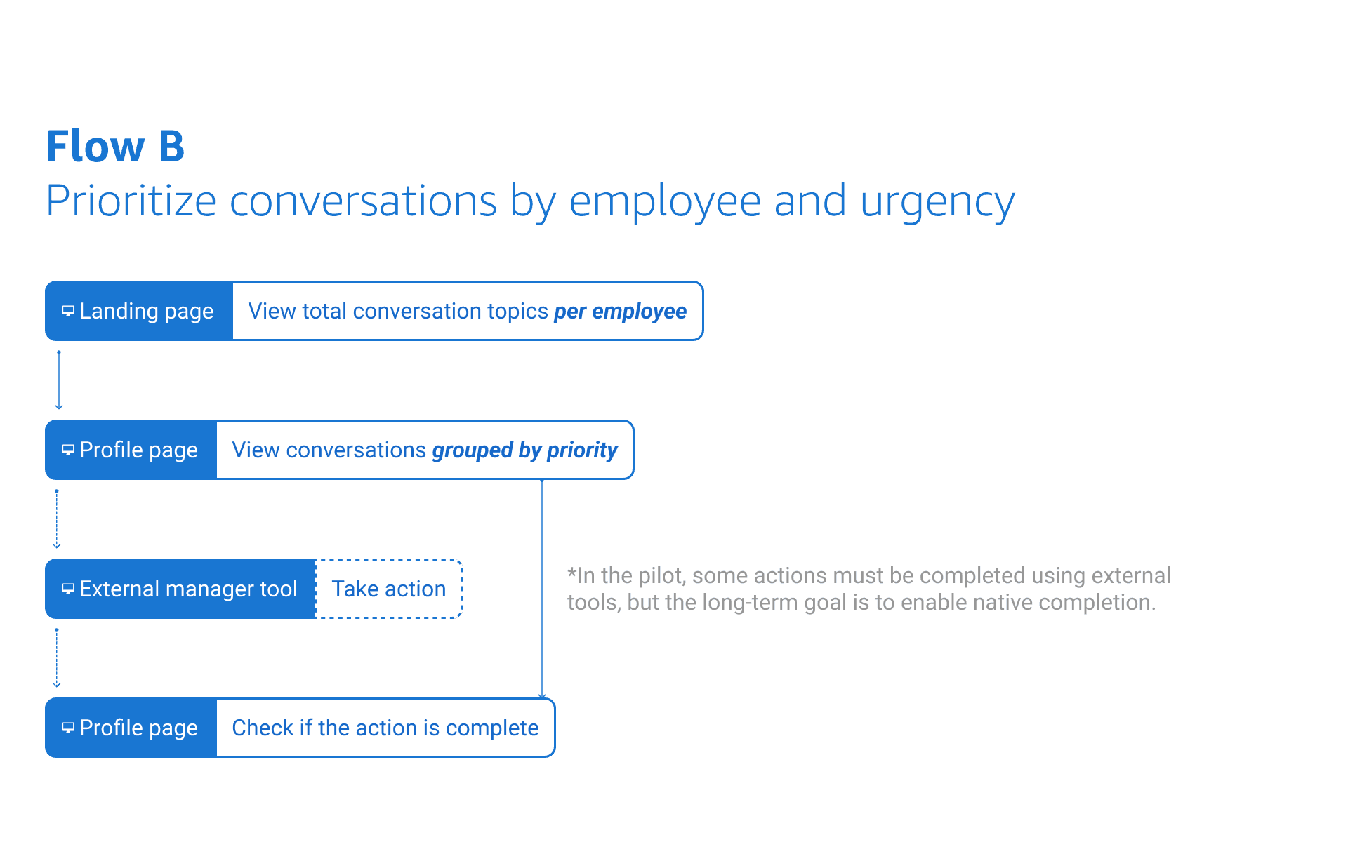
Glance, drill down, back to work.
Effortlessly prioritize team members for a quick chat.
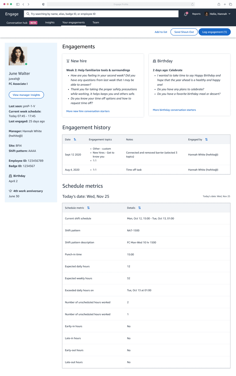
Chat, note down, stay in the groove.
Use insights to guide every chat, log details for later, and take care of your team effortlessly.
Org Problem
TOO MANY manager tools are distracting.
44.35% of 480K associates who left Amazon cited managers as a key factor. Managers spend 25% of their time juggling over 20 types of conversations, leading to robotic interactions and weakened relationships. Engage stands out as the solution to foster stronger connections between managers and their teams.
Product Problem
Siloed experiences do not meet manager needs.
Engage was originally designed to display its own engagement data. Now, managers want one tool with comprehensive data for priorities, allowing more time for quality conversations.
Customer pain points
Managers waste time navigating disconnected tools.
From auditing current experiences, interviewing leaders, and analyzing product data, I identified key problems:
"I want to know who I should prioritize to talk with, know what to talk about, take notes, and cover my whole team."
- an area manager with 3 years of experience, currently managing a team of 30

Robotic Engagement
Group-based actions optimized efficiency but led to robotic check-ins.

Insufficient Filtering
Lack of functionalities like location-based filters hinders effective engagement.

Display Limitations
Important details are often missed below a 680px viewport height.
Empathizing with Managers
Designing to help managers identify team members with urgent needs and hold comprehensive conversations.
Customer Goal
Managers need to quickly find and address on-site team members with urgent needs.

Option A: Filters at Page Top
🟢 Visible options
🟢 Quick and easy filtering
🔴 Takes up large space for filters rather than content

Option B: Filters as a Slide-in Side Panel
🟢 Clean, uncluttered state
🔴 Requires more interactions to filter
🔴 No clear expectations of supported filters
For the pilot design, I chose option A to introduce these changes to existing users, enabling quick filters and immediate results in the content area below.
Customer Goal
Managers want to view each person's needs holistically.

Option A: People as Cards
🟢 Familiar pattern
🟢 Visualizes each person with a headshot
🔴 Less scalable with complex data
🔴 Harder to compare across people
Option B: People in List View
🟢 Easy to compare across people
🟢 Accommodates complex data
🔴 Reduces each person to a data row
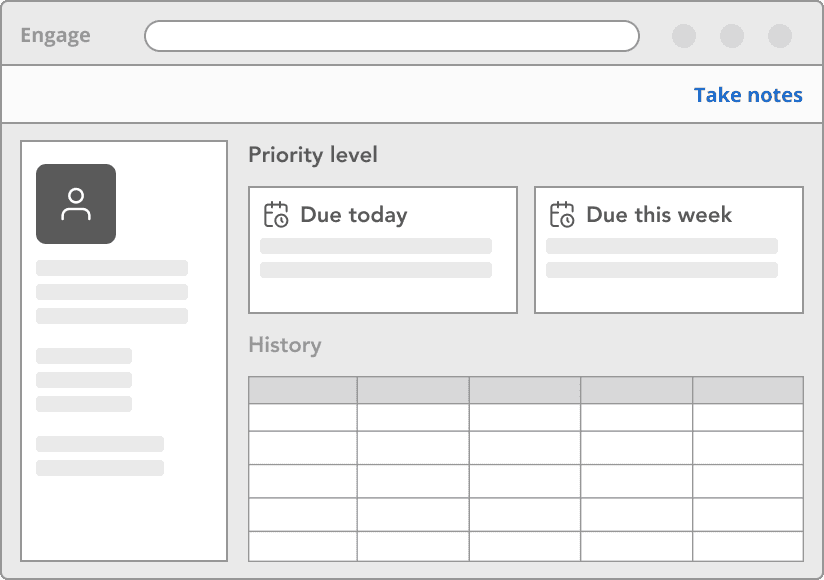
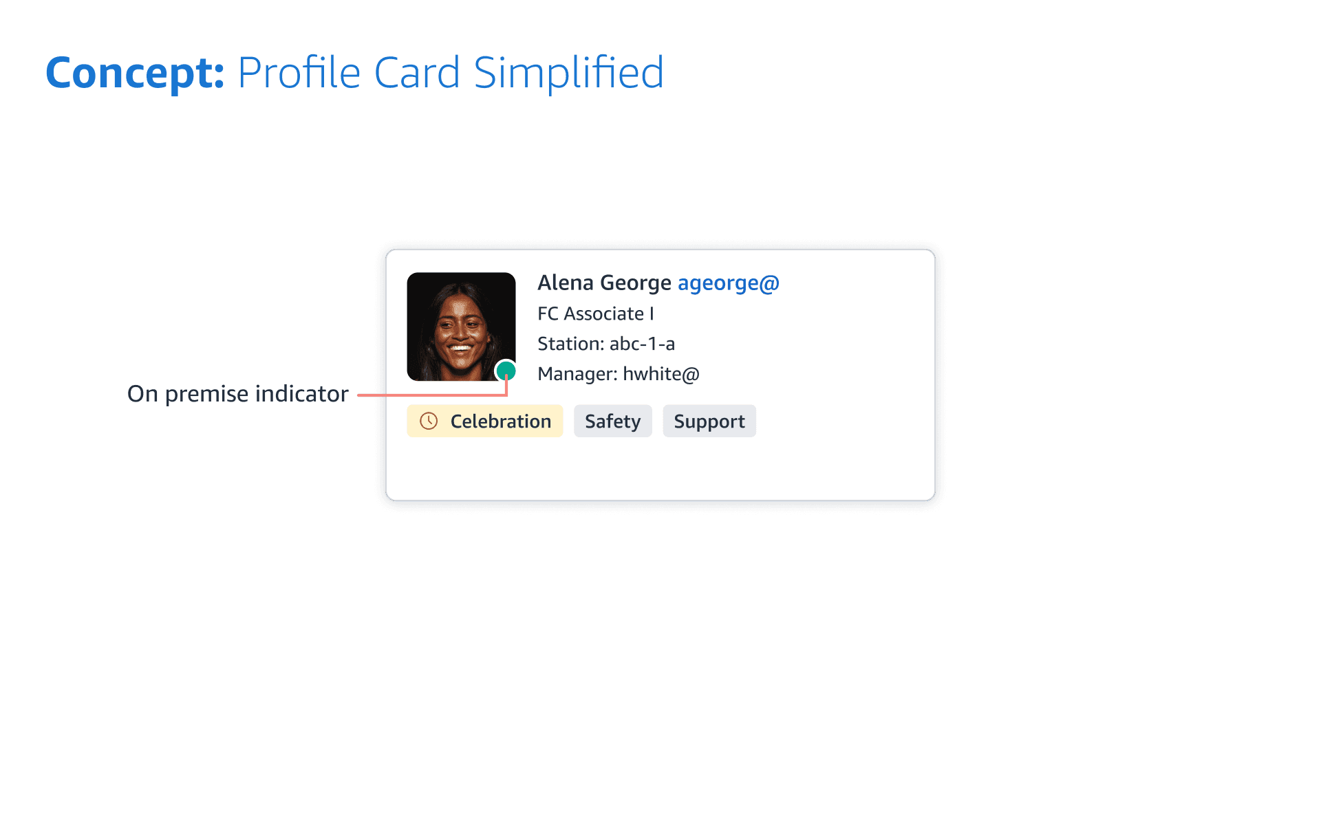
Engage traditionally visualizes people as cards. Despite challenges with complex data, I adopted Option A for the pilot, allowing managers to view headshots and easily distinguish people.
Customer Goal
Managers want to know priorities for each employee.

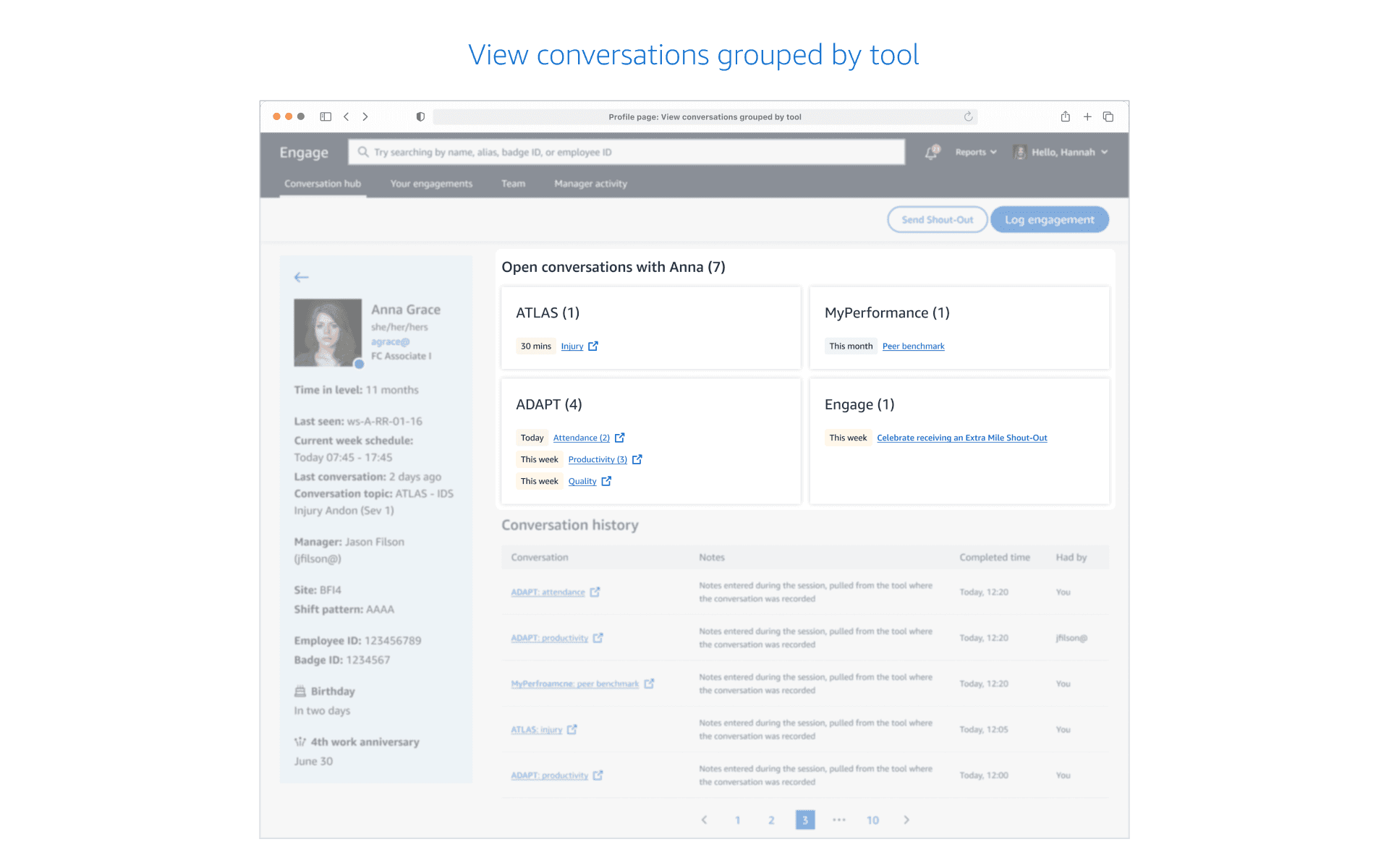
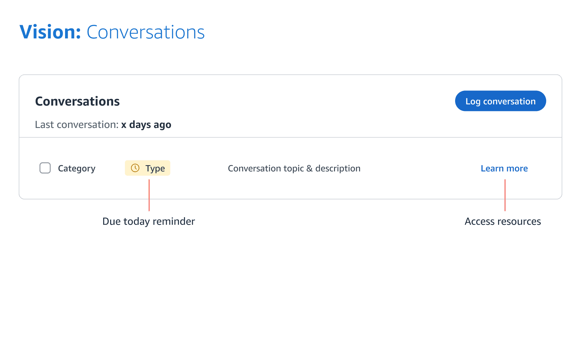
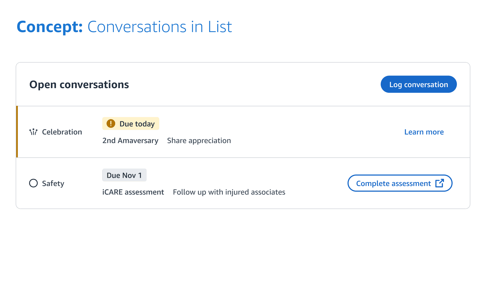
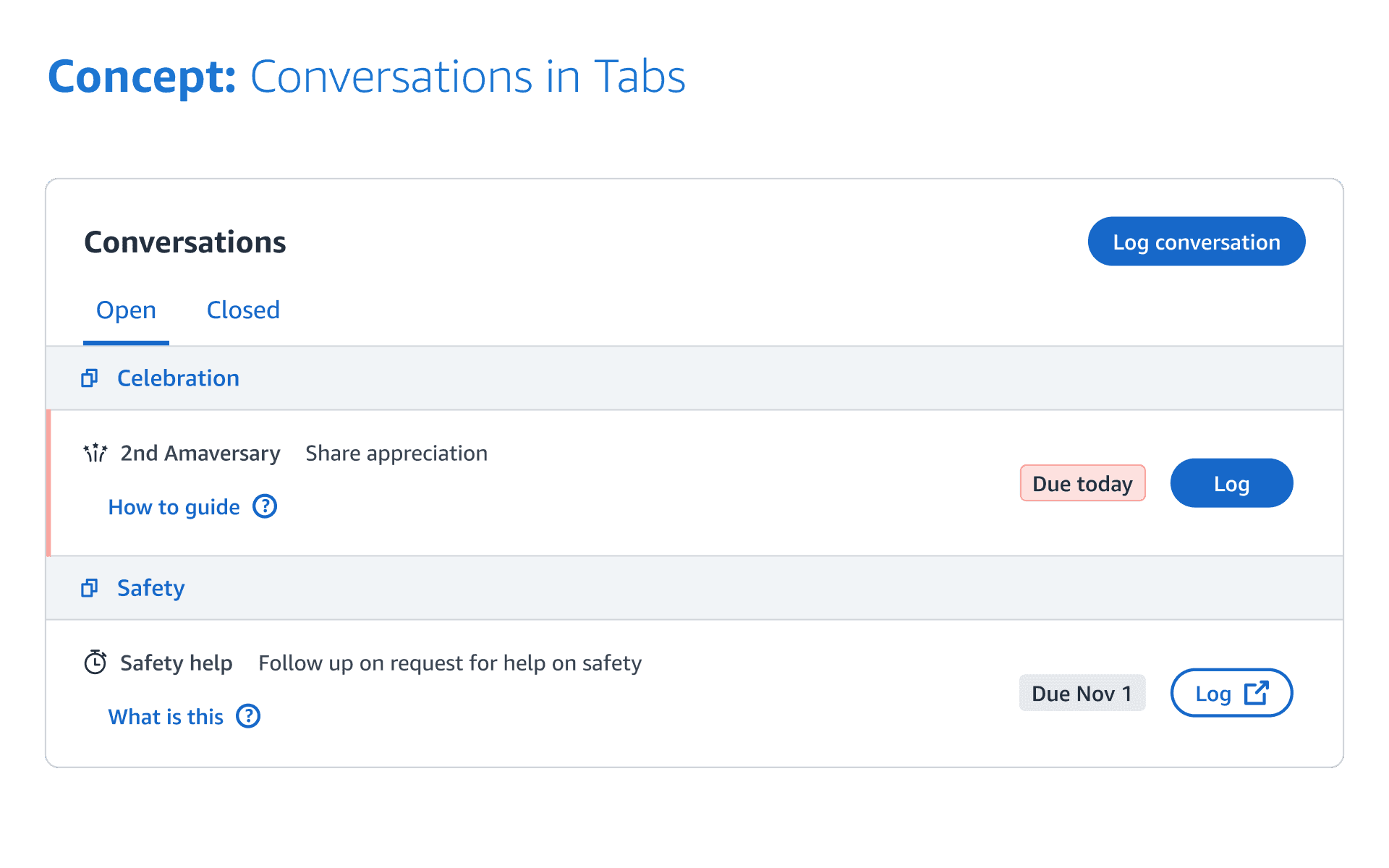
Option A: Categorized by Conversation Type
🟢 Organize topics by the same type and source
🔴 Urgent topics may be buried
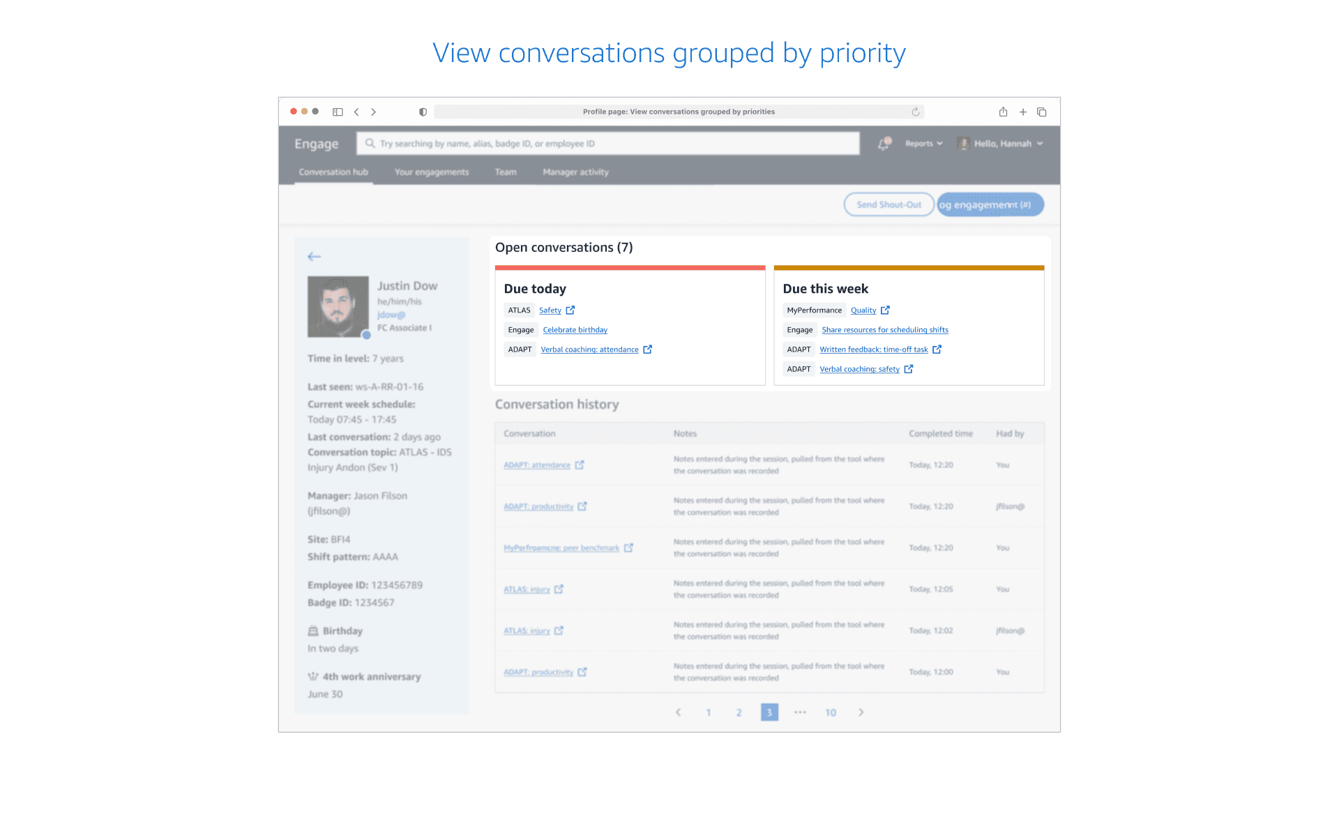
Option B: Categorized by Due Date
🟢 Easy to address topics by urgency
🔴 Hard to address similar topics together
For the pilot, it is crucial to determine how to present multiple topics to managers in a meaningful way. I was concerned that Option B might create false urgency, so I chose to test both concepts for further validation.
Iterating Pilot Design with Customer Input and Constraints
While designing the pilot, late-stage constraints from product/tech partners required quick pivots:
Users must navigate to other manager tools to document for related conversation topics.
Conversation topics can only display the source product/tool, not high-level categories.
Iteration #1
Testing High-Level User Flows
Time to piece together the key screens into a coherent and intuitive experience. I tested initial flows with 8 business users to explore and confirm my hypothesis.
Flow Preference: 6/8 users preferred option A over option B.
Familiarity: 7/8 users related to option A due to its similarity with the existing product.
Count Awareness: 3/8 users noticed the conversation topic counts across pages.
Option B Concerns: 3/8 users questioned the relationship between counts and tags on the landing page.
Grouped by Priorities: 1/8 users liked the grouping by priorities but asked how priorities were unified across manager tools.


Iteration #2
Ensuring Cross-product Consistency after Reorg
A reorg led to the formation of a centralized design system team tasked with ensuring cross-product consistency. Collaborating with designers from various products, I contributed to co-creating the foundational layout for the Profile page, aiming for global consistency while acknowledging potential trade-offs in local optimization.

Iteration #3
Defining Scalable Components
I identified the need to define reusable components across the entire user experience. I showcased several concepts to understand user needs, adjusting designs as necessary given our reliance on other product teams for data integration.


A Pilot that Transformed Product Strategy
This pilot underscored the essential role of rich, personalized data in contextualizing engagements.
‘Since I joined Amazon, I've never understood why it's acceptable to have 35 tabs. This is awesome. Does it mean that it's mandated that every future priority conversation goes here?’
- a senior leader
Key Achievements
Initially launched in 12 US fulfillment centers, expanding nationwide and planning global expansion in the EU.
Despite handling more complex data, satisfaction levels significantly increased, further enhancing the product's reputation.
Integrated products experienced heightened completion rates.
My Reflections: Scaling Design and Navigating Complexity at Amazon
This project felt like building from the ground up, because of lacking established benchmarks for internal tools at Amazon.
1
Promoting transparency to avoid last-minute design requests caused by silos and narrow perspectives.
How?
Issue periodic newsletters with design updates to engage and align stakeholders, and host ad-hoc sessions for information sharing.
2
Effective communication and coordination are crucial for seamless teamwork.
How?
Document key meeting decisions for offline collaboration. Identify and circulate golden source documents to build common ground.
3
Embracing an agile and adaptable mindset, prepared to pivot while keeping eyes on the big prize.
How?
Address immediate challenges while embracing ambiguity, focusing on refining long-term vision to guide the team towards the north star.